
MASTHEAD + MAGAZINE LAYOUT & DESIGN
- Ilinca Moisa

- Feb 26, 2021
- 3 min read
By taking into consideration the magazines which we analysed and which concepts we wanted to incorporate in the creation of Sylk Magazine, Ana and I started brainstorming design and layout ideas. Due to the pandemic, our best option was to work together while talking to and seeing each other on a video call. Firstly, we discussed what we were envisioning and then each started sketching, while keeping in mind the fact that our masthead, design and layout should reflect the core essence of Sylk Magazine: elegance, style, timelessness, as well as modernism.
Below you can see all of our sketches for the: MASTHEAD
FRONT COVER
TABLE OF CONTENTS
DOUBLE SPREAD


(the ones with the grey background were drawn by Ana and the ones with the wooden background by me)
After showing each other our sketches, we realised that they were extremely similar, since we had the same outcome in mind.
For the masthead, we decided upon the one in capital letters, with the 'Y' and 'L' parallel to each other, since we believe that it is very stylish, elegant and timeless, yet still very modern. For the front cover, we decided that we wanted to keep it very minimalistic in terms of writing so besides the masthead we will only be adding the title of our issue. We are thinking of writing 'the' and 'issue' in some sort of handwritten/italic font and the actual title in capital letters, in a more modern font. It would look something like this: 'the INNER STYLE issue'.
For the table of contents page we decided upon writing in an italic/handwriting font 'Table of contents' and below it, alternating the text with some photographs which could be found inside the magazine. On the left top side we'll write some of the contents and on the right top side we'll put a collage of pictures; on the bottom left side we'll put some more pictures and on the bottom right side we'll write the rest of the contents.
As for the double spread, we think it would be best to wait until we do our photoshoots in order to see what kind of design and layout would look good with each picture.
Soon after finishing these sketches, our school opened and we were able to start working on our masthead. We chose to do it using Adobe Illustrator, which was a challenge for the both of us, since we hadn't used it before. But, after some practice, we figured it out, though it took us a long time to get to our end result. Below you can see some photos of us at school, working on the masthead:


me^ Ana^
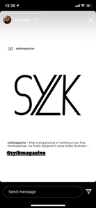
Here is a screen shot of our final masthead:

We're both extremely proud of ourselves for creating this and we think it is better than what we envisioned. We had some help from our teacher as well, but overall it was a long process that we figured out mostly by ourselves.
We decided to update our Sylk Magazine Instagram profile and to put our masthead as our profile picture. We posted the masthead on our feed as well and both of us promoted the post on our personal accounts' stories. Also, we changed a few things in our bio, one of them being writing 'COMING SOON', in order to intrigue and to grow our audience and followers. Below you can see some screenshots showing what I've just explained.
Sylk Magazine account post on our feed my story Ana's story


Comments